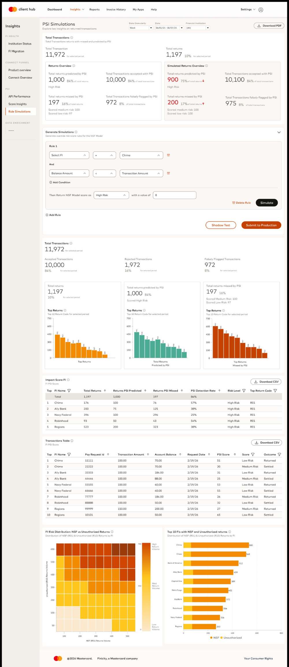
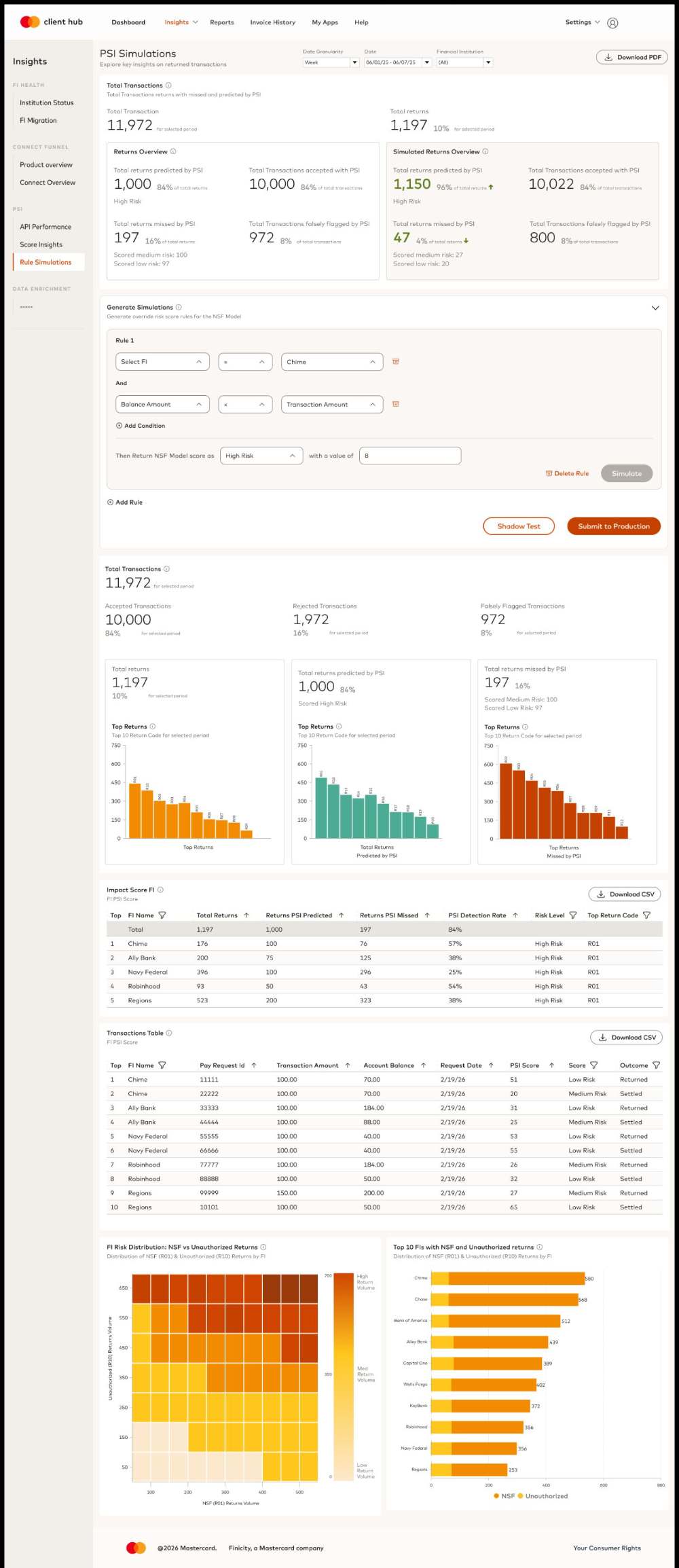
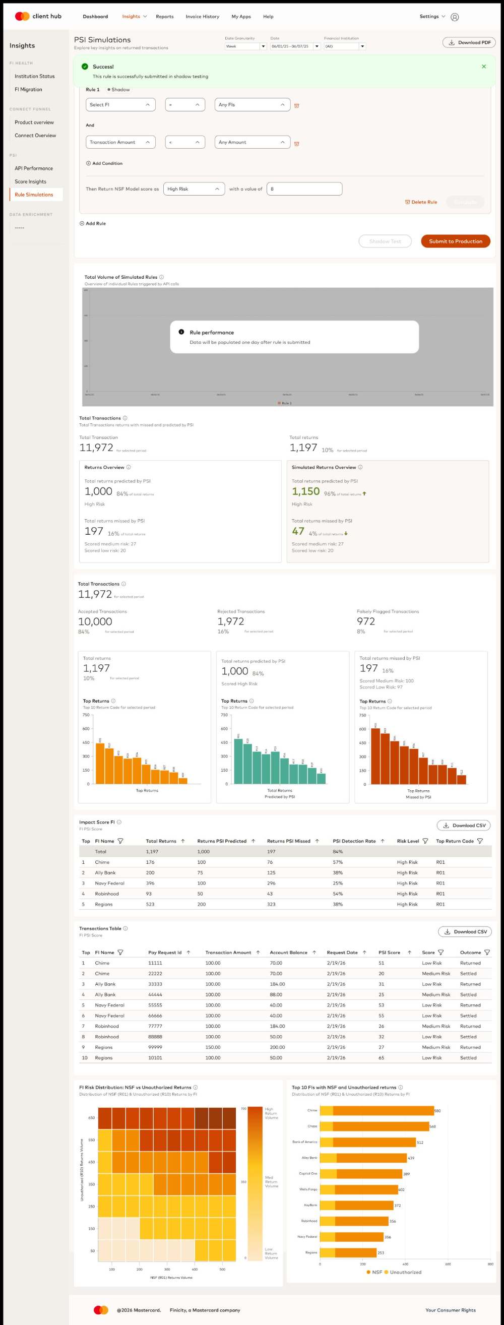
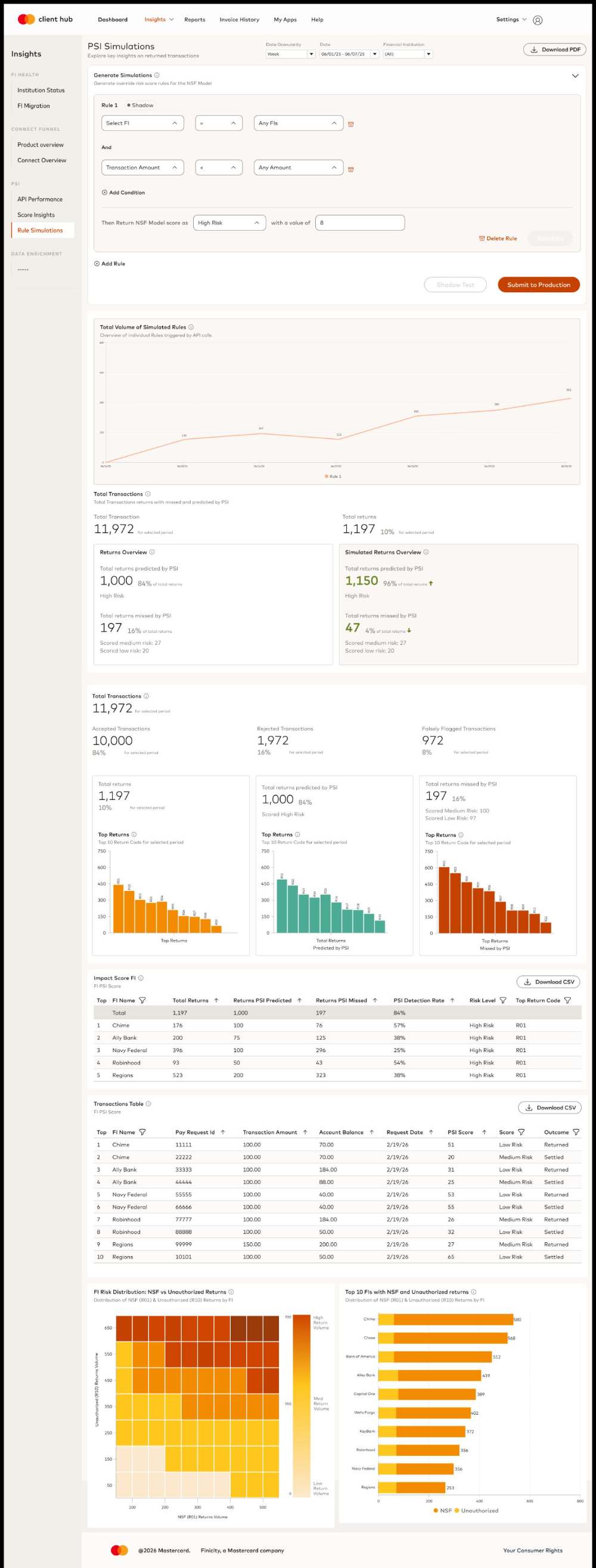
PSI Dashboard, turning raw payment risk data into decisions partners can act on
Data DashboardB2B0 to 1AI
A client-facing dashboard for Payment Success Indicator (PSI), so external partners can monitor payment-risk performance, understand transaction results, and manage fraud rules in one place.
PSI DASHBOARD IN MOTION
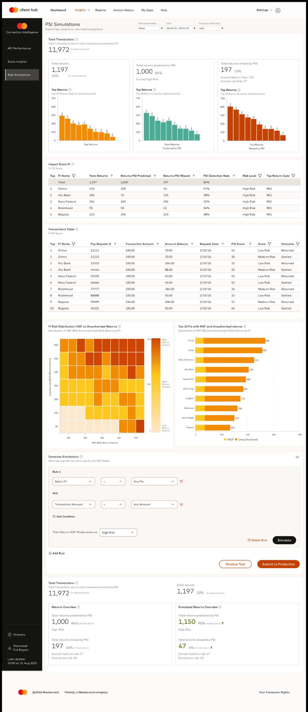
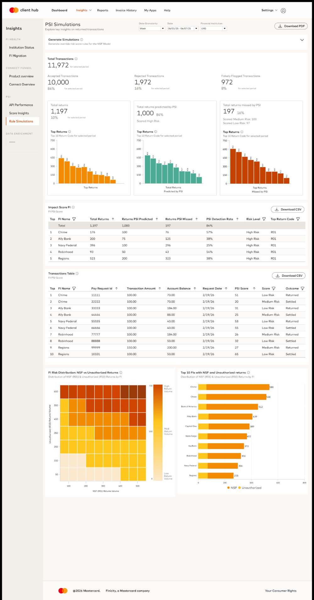
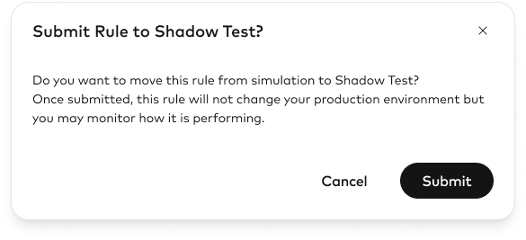
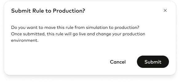
RULE SIMULATIONS REPLAY A RULE BEFORE IT TOUCHES PRODUCTION
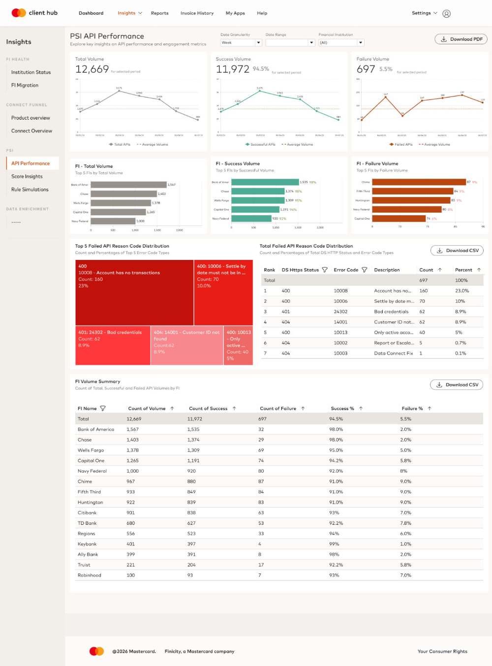
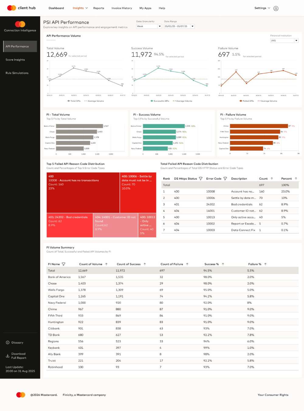
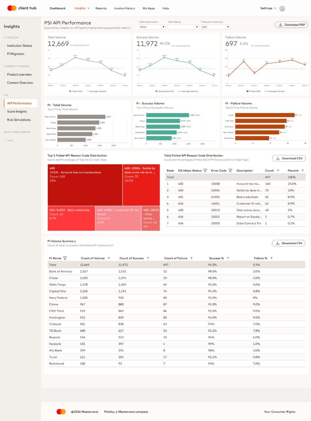
API PERFORMANCE MAKES SYSTEMIC FAILURES VISIBLE IN ONE PASS
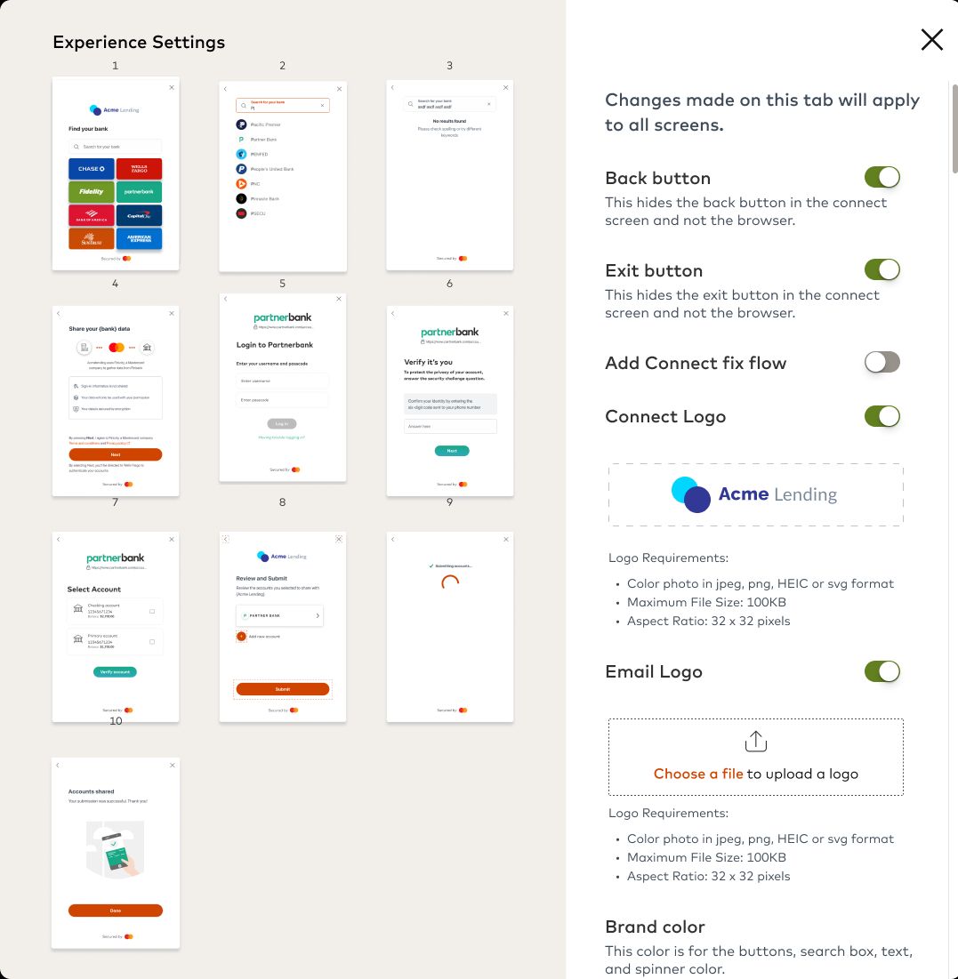
Customize Connect, letting clients brand and configure Connect without engineering
Self-Serve ToolB2BClient HubWeb
A self-serve customization tool inside Client Hub, so clients can align the Open Banking Connect experience with their own branding and user journey without waiting on engineering.
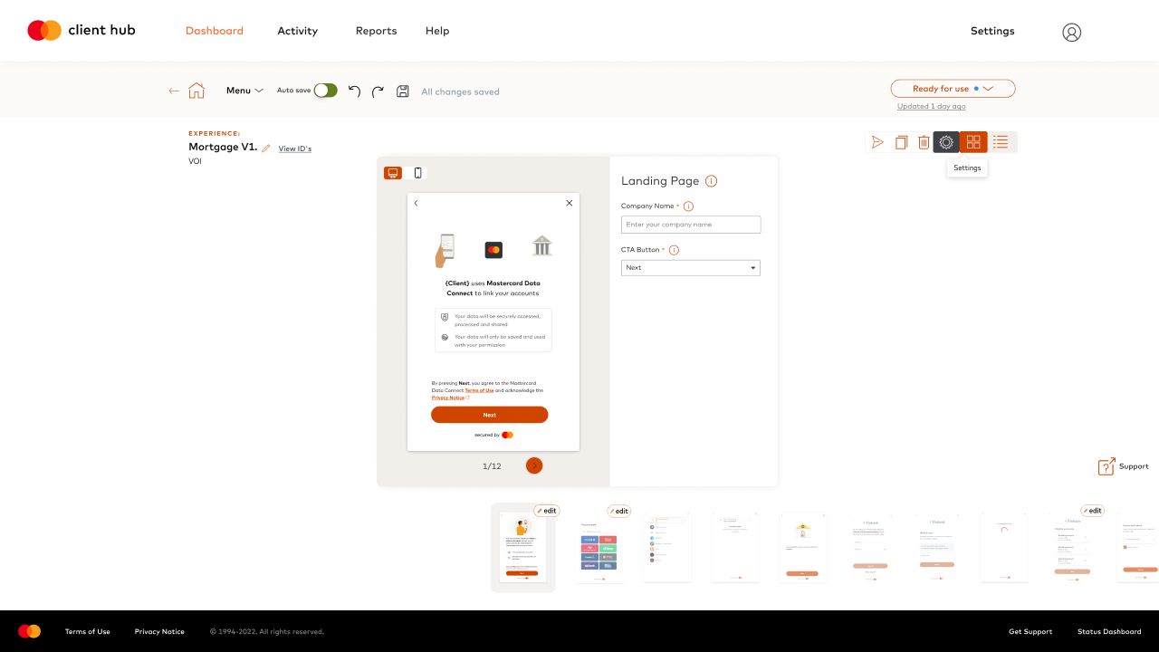
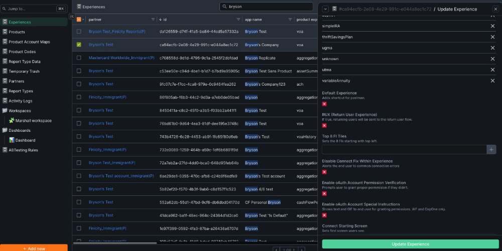
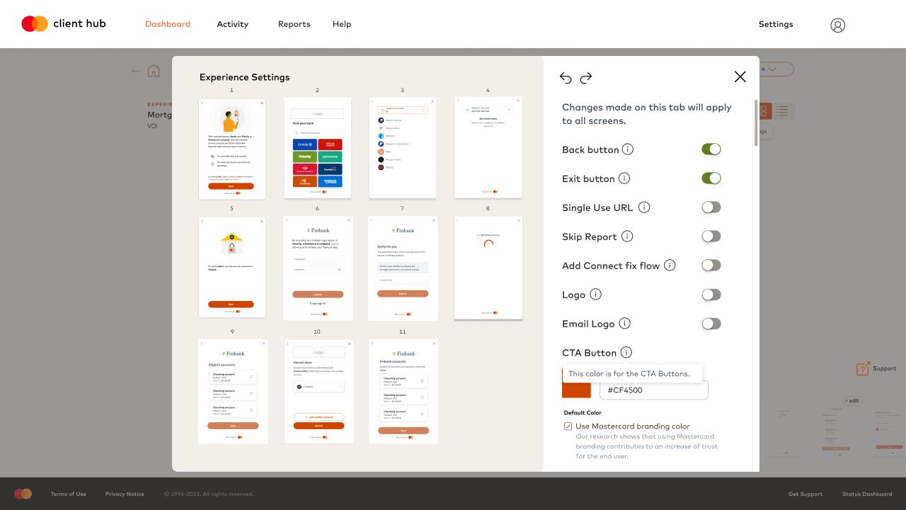
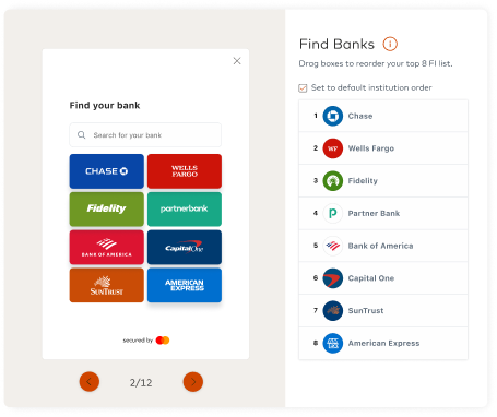
CLIENTS REORDER FINANCIAL INSTITUTIONS FOR THEIR OWN PRODUCTS
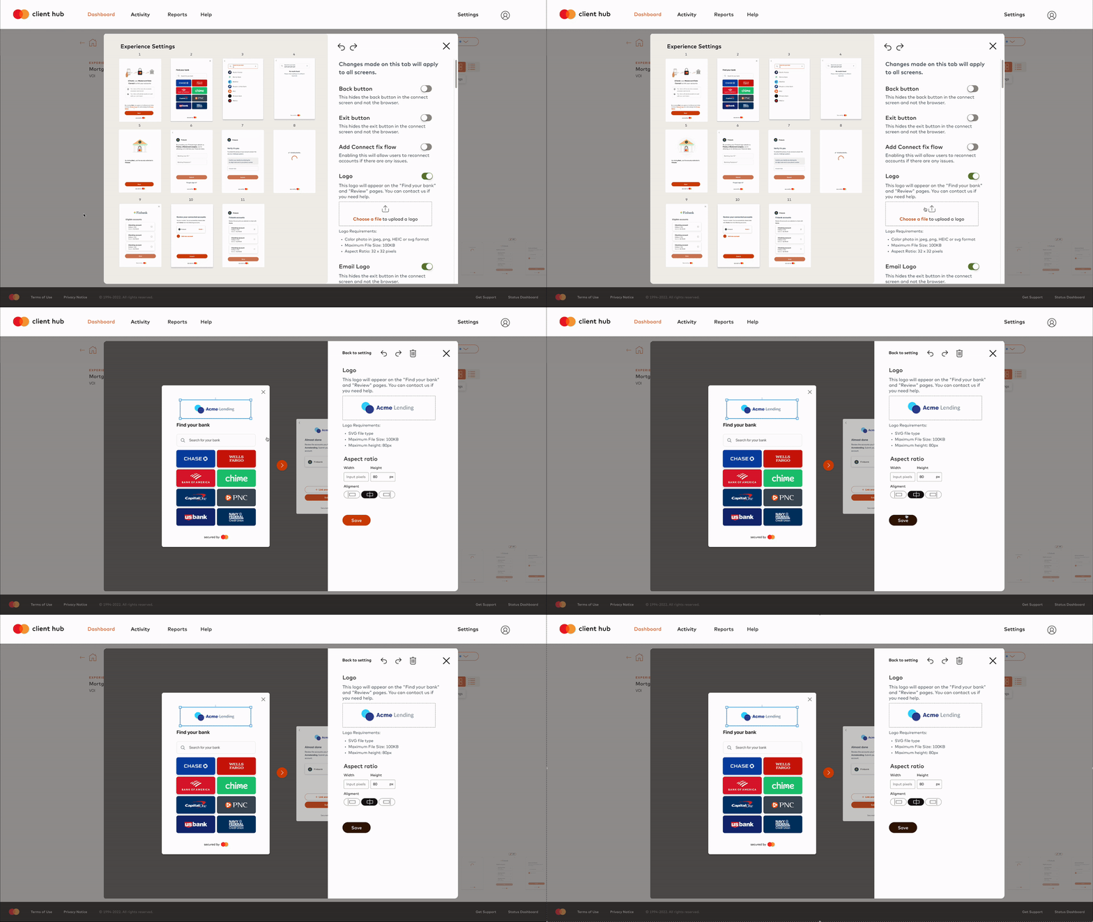
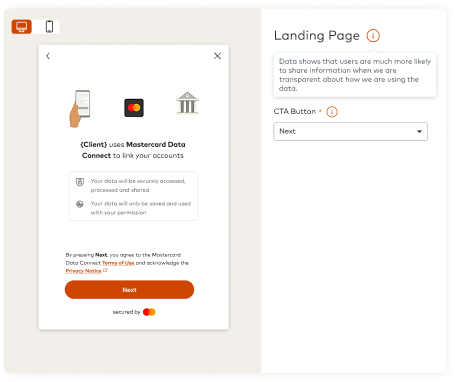
CLIENTS UPLOAD THEIR OWN LOGO AND SEE IT APPLIED ACROSS SCREENS
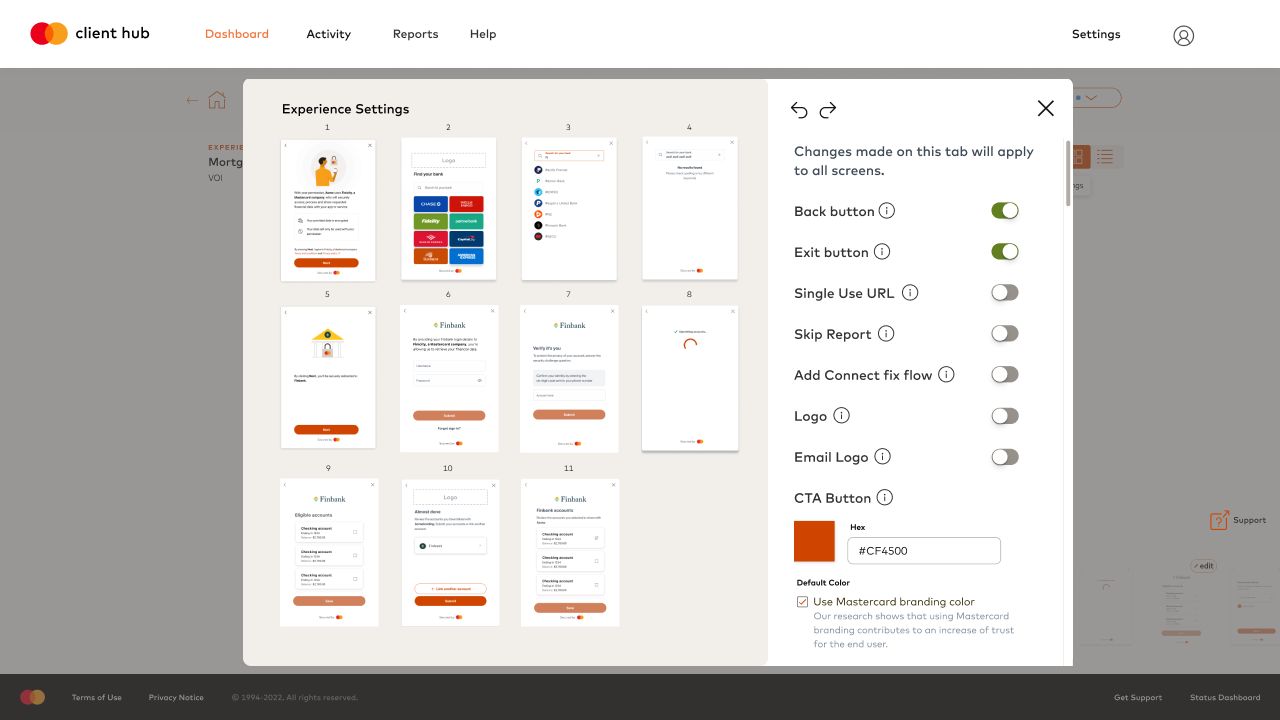
TOGGLES, LOGO AND CTA COLOR APPLY ACROSS EVERY CONNECT SCREEN
A COVID-19 testing flow built into the Uber app, for riders and drivers
MobileService DesignConcept
Built upon the Uber app to create a unique experience of covid-19 testing that addresses the concerns and safety needs of the riders and drivers.
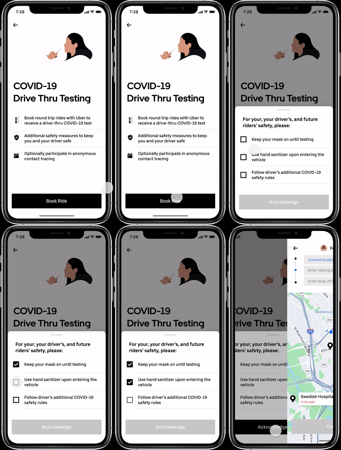
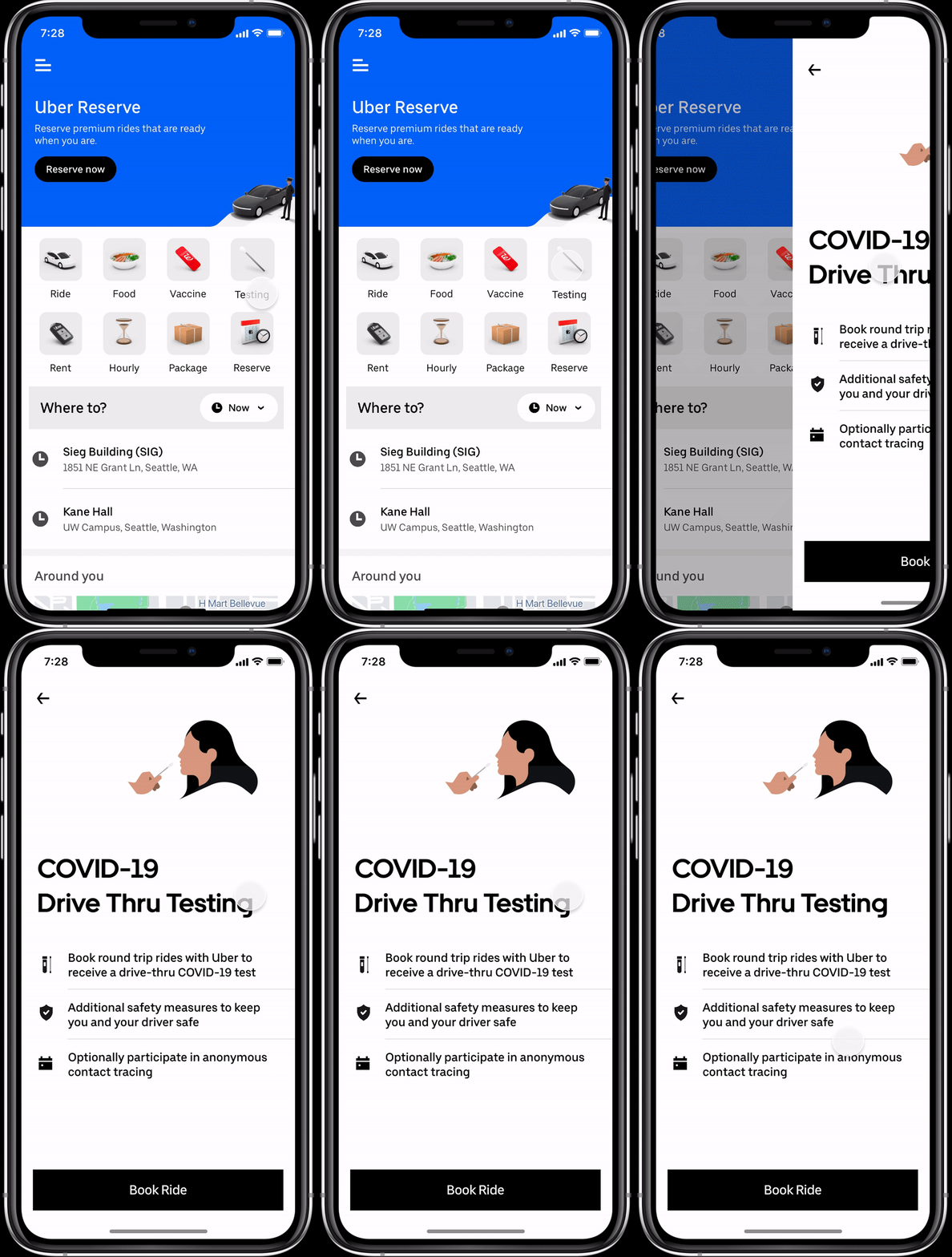
ROUND TRIP TO A DRIVE-THRU TEST, BOOKED IN THE APP
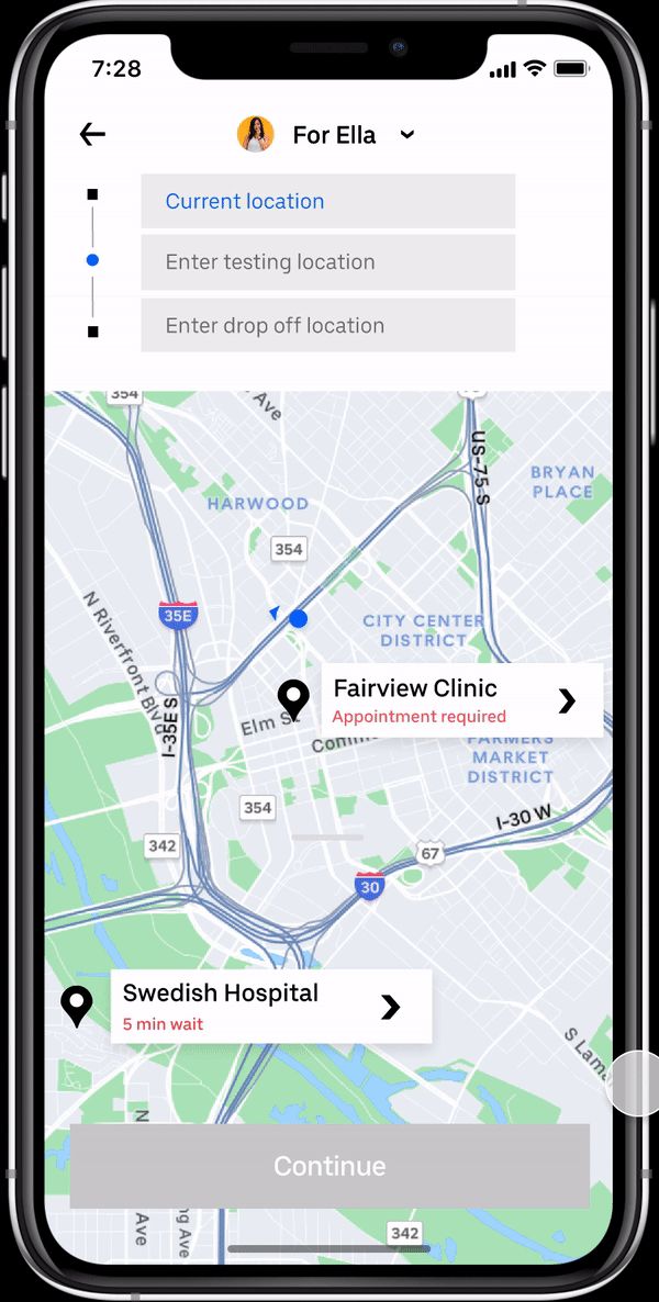
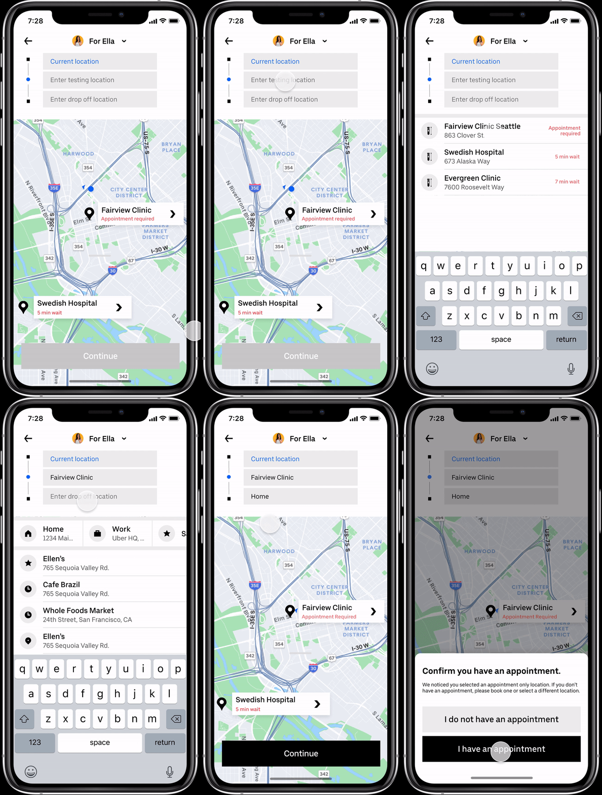
TESTING SITES WITH WAIT TIMES AND APPOINTMENT RULES
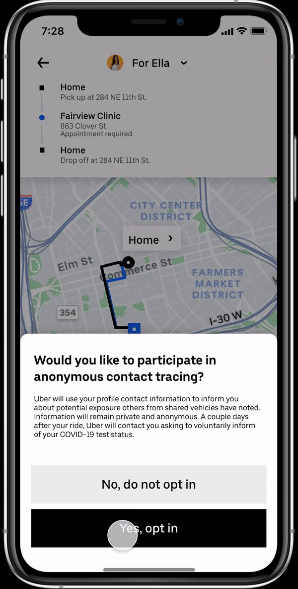
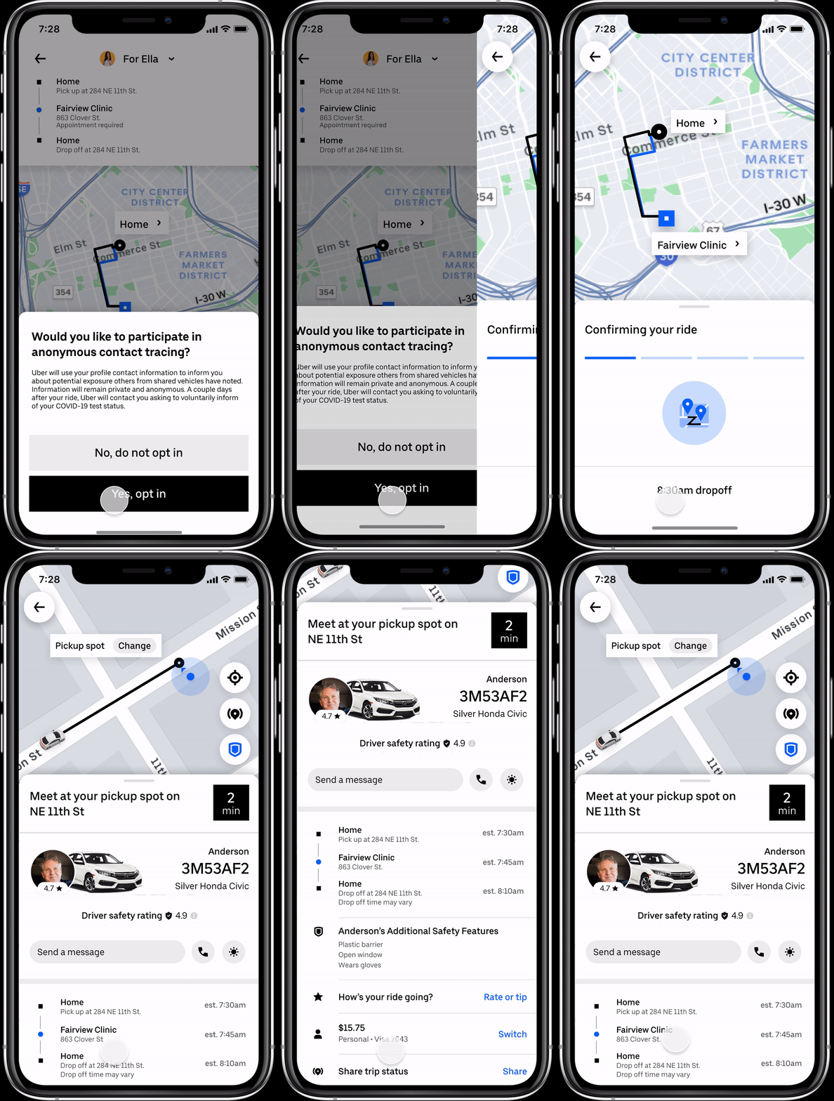
DRIVER SAFETY INFO AND OPT-IN CONTACT TRACING
{{ caseName }}
CASE STUDY / PAYMENT RISK
PSI Dashboard: From Raw Risk Data to Actionable Intelligence
Empowering risk managers to transition from reactive monitoring to proactive, confident decision-making.
B2B DATA PRODUCTRISK & FRAUDSIMULATIONSHIPPED
IMPACTShipped to production
40M → 60MOpen Banking users supported (U.S.)
4.7 / 5.0Clarity and usability, three test rounds
→ Reactive to proactive: rules validated before production
WHAT I DID · JUMP
TEAM
Lead Product DesignerEnd-to-end
Cross-functionalPM · Eng · UX Research
TIMELINE
Research → ShipB2B / Payments
DomainOpen Banking risk
Executive summary
The Challenge: Payment Success Indicator (PSI) uses AI to predict two kinds of account-to-account payment returns — non-sufficient funds (NSF) and unauthorized fraud — and scores every transaction for both. Those results reached partners only through APIs. PSI had no client-facing dashboard with aggregated user and transaction insights, which left partners without transparency and the product without competitive parity.
The Solution: An MVP dashboard that turns PSI’s technical API outputs and reason codes into a single source of truth for partners: performance monitoring, explainability behind each risk result, and a self-service rules-management experience where fraud rules can be simulated before they go live.
WHAT PSI IS
Two predictions per transactionNon-sufficient funds (NSF) and unauthorized fraud. Every transaction is scored for both.
0–100, higher is safer
0–10 · high risk11–30 · medium risk31–100 · low risk
A higher score means a greater likelihood of successful settlement.
What sits behind a scoreNSF analysis uses real-time balance, forecasting up to ten days, and eight weighted reasons — balance history, NSF history, spending, deposits, transaction amount. Unauthorized-return analysis covers current-day risk, with the Mastercard Identity Risk Network in development.
HOW THIS PROJECT MOVED
Problem: the “Data-Action” gap
PSI delivered NSF and unauthorized-fraud scores through APIs, but nothing helped partners read them. The scores arrived without aggregation, without explanation, and without a way to act.
01
WHAT THEY HADScores and reason codes over API
NSF
FRD
RET
API
FI
02
WHAT WAS MISSINGNo actionable context
Scores arrived without aggregation
without explanation
Without a way to act
→
No actionable context
03
CORE PAIN POINTS
01
High Cognitive LoadRisk scores arrived with reason codes, but nothing explained why PSI landed on a result.
02
Operational Blind SpotsIdentifying API health issues or systemic failures was slow and manual.
03
Lack of PredictabilityNo way to test a scoring rule change before production.
04
QUESTIONS THE DASHBOARD HAS TO ANSWERThe design challenge was to turn PSI’s API outputs and reason codes into an experience where a partner can answer five questions quickly.
Q1How are transactions performing?
Q2Where is NSF or unauthorized-return risk concentrated?
Q3Why did PSI assign a particular risk result?
Q4What action or fraud rule should the partner consider?
Q5How is performance changing across users and transactions?
“We have the data, but we don't know what to do with it.”PARTNER FEEDBACK
Before research: learning the data
I could not interview a risk manager about a score I did not understand myself. So the first week was spent with the product and engineering material, mapping what PSI actually returns for a single transaction — and where a partner would have to make a judgment call.
ONE TRANSACTION
Checking…3456
Balance$5,752.00
Transfer amount$1,000.00
Ex: an account funding transaction.
SCORE OUTPUTSEvery transaction is scored for both risks.
1Non-Sufficient Funds
Settlement risk score 0–100, forecast up to ten days to predict optimal payment timing, plus real-time account balance.8 weighted score reasons
Settlement risk score 0–100 for the current day, from real-time analysis.Optionally incorporates the Mastercard Identity Risk Network, a feature still under development.
SCORE RANGESA higher score means a higher likelihood of settlement.
0–10
High Risk
High risk of insufficient funds or unauthorized fraud return.
11–30
Medium Risk
Moderate risk of insufficient funds or unauthorized fraud return.
31–100
Low Risk
Low risk of insufficient funds or unauthorized fraud return.
READING A SCORE OF 5
NSF Score = 5The account is unlikely to have enough funds to cover the transaction.
Unauthorized Return Score = 5The transaction is likely initiated by a first or third-party fraudster.
Both scores read “5,” both mean high risk, and they mean two entirely different things. That was the moment the design problem became clear: the number is not the answer, and averaging the two would destroy the only information a partner can act on.
Research
LEAN UX
1. Research
7+ interviews
2. Synthesize
Competitive benchmarking
3. Iterate
Hi-fi prototypes
4. Validate
7+ participants
Discovery: 7+ in-depth interviews and competitive benchmarking to map how risk managers think.
Iteration: Hi-fi prototypes tested with 7+ participants for clarity under pressure.
INTERVIEW GUIDE · 6 TOPICS
A structured guide to learn how clients use current PSI visualization tools, and what a dashboard would need to change.
{{ t.num }}
{{ t.label }}{{ t.probe }}
Paired with client outreach templates for scheduling.
CROSS-FUNCTIONAL LEADERSHIP
PMsAligned design roadmap with business growth goals.
EngineersWeekly feasibility checks on real-time simulation.
UX ResearchersValidated that changes reduced cognitive load.
Strategy: Designing for Confidence
Users didn't need more data. They needed more certainty.
THRESHOLD
?
{{ shiftTitle }}{{ shiftSub }}Simulate before shipping{{ shiftDetail }}
The simulation environment
V1 · 03 RULE SIMULATIONS
The rule table users could read but not act on. ↑ back to the first pass
→
V2 · SIMULATION ENVIRONMENT
SIMULATED VS. PRODUCTION
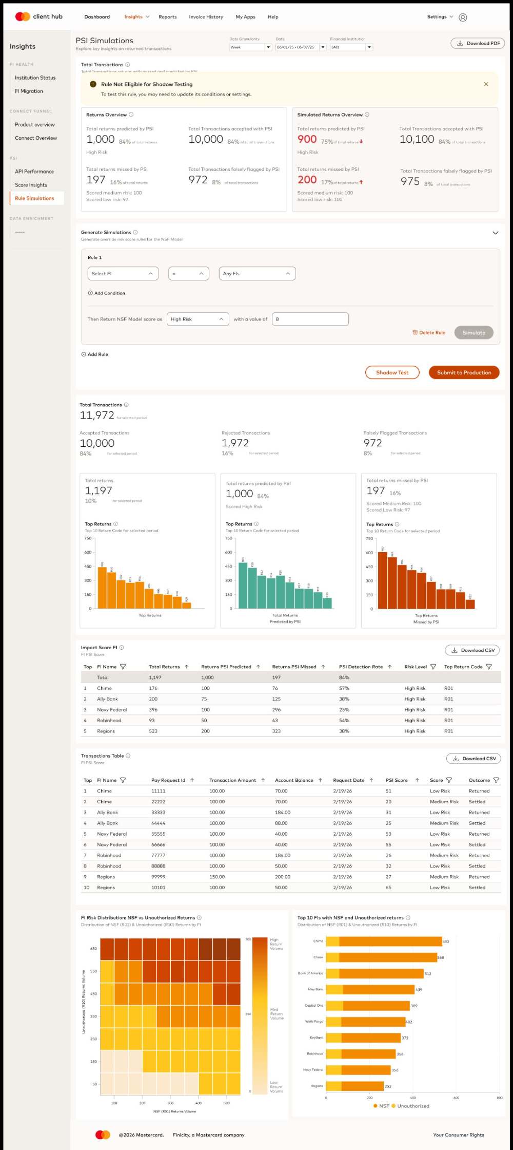
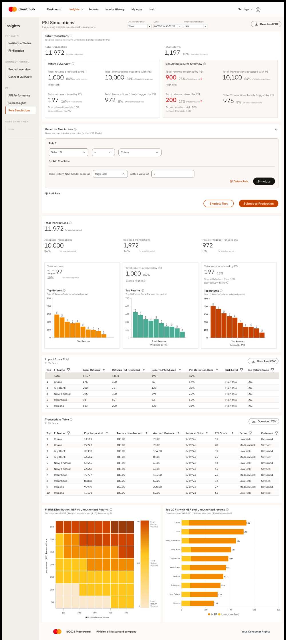
The same rules, now runnable: change one, see the impact before shipping.
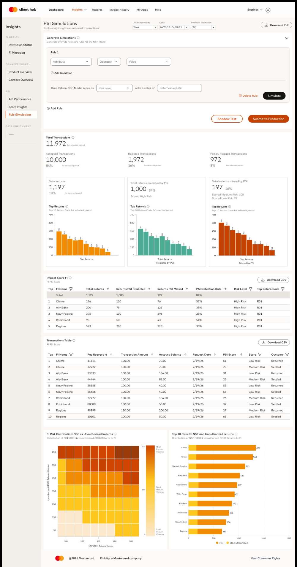
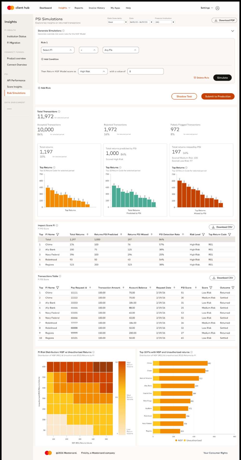
The answer to “what happens if I change this?” was not a slider. Partners write an override rule against the NSF model, run it over real historical volume, and read the predicted returns before anything reaches production.
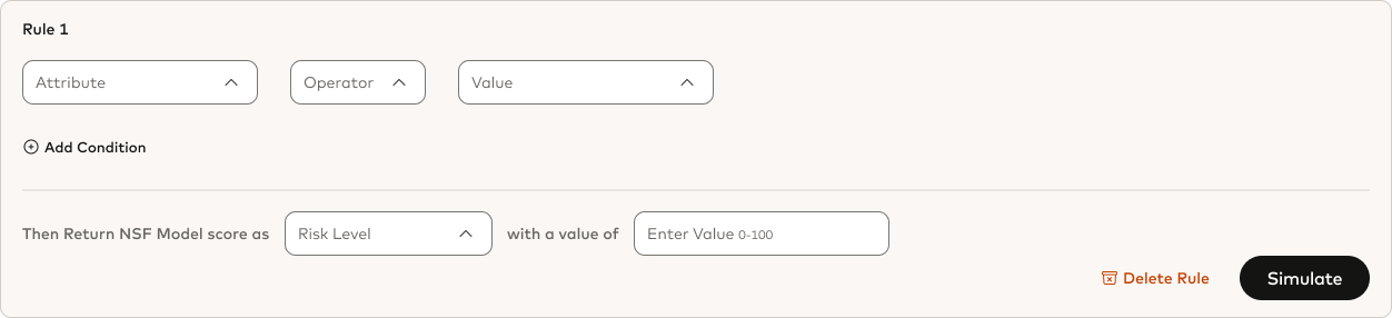
Generate SimulationsGenerate override risk score rules for the NSF Model
Rule 1
IfSelect FI=
AndTransaction Amount
Then Return NSF Model score as
{{ hintSetup }}
{{ hintRun }}
Replaying Rule 1 over 11,972 transactions…06/01 – 06/07
RETURNS OVERVIEW · PRODUCTION
Total returns predicted by PSI
1,00084% of total returns
Total returns missed by PSI
19716% of total returns
1,197 returns of 11,972 transactions, selected period.
SIMULATED RETURNS OVERVIEWRULE 1
Total returns predicted by PSI
{{ simPredicted }}{{ simPredictedPct }} of total returns↑
Total returns missed by PSI
{{ simMissed }}{{ simMissedPct }} of total returns↓
{{ simNote }}
{{ applyTitle }}→ {{ applyBody }}
First design pass
FIRST DESIGN AFTER RESEARCH · 3 SCREENS
The first pass translated the interview findings into three surfaces. Scroll each frame to see the full screen.
WHY THIS SCREEN LOOKS THIS WAY{{ firstLabel }}
{{ firstWhy }}
{{ firstAnswers }}HOVER A DECISION → THE SCREEN HOLDS ON IT
V1 · {{ firstLabel }}
{{ r.num }}
Testing
Three rounds of hi-fi prototype testing with 7+ risk managers, each round checking a different one of the five questions: can they read performance and risk concentration, do they understand why PSI scored a transaction, and will they manage a rule themselves.
{{ roundFocus }}
TESTED{{ roundTested }}
FOUND{{ roundFound }}
CHANGED{{ roundChanged }}
4.7 / 5.0clarity and usability after round 3
7+participants per round
Iterations after testing
V1 → FINAL
Three changes carried the weight of the feedback. Each one is shown before and after, at the part of the screen it touched.
01API PERFORMANCE
An FI filter on the page itselfPerformance could only be read in aggregate. The header now carries a Financial Institution filter, so a partner can isolate one institution and see its volume, success and failure behavior on its own.
BEFORE · NO FI FILTER
AFTER · FI FILTER IN THE HEADER
02SCORE INSIGHTS
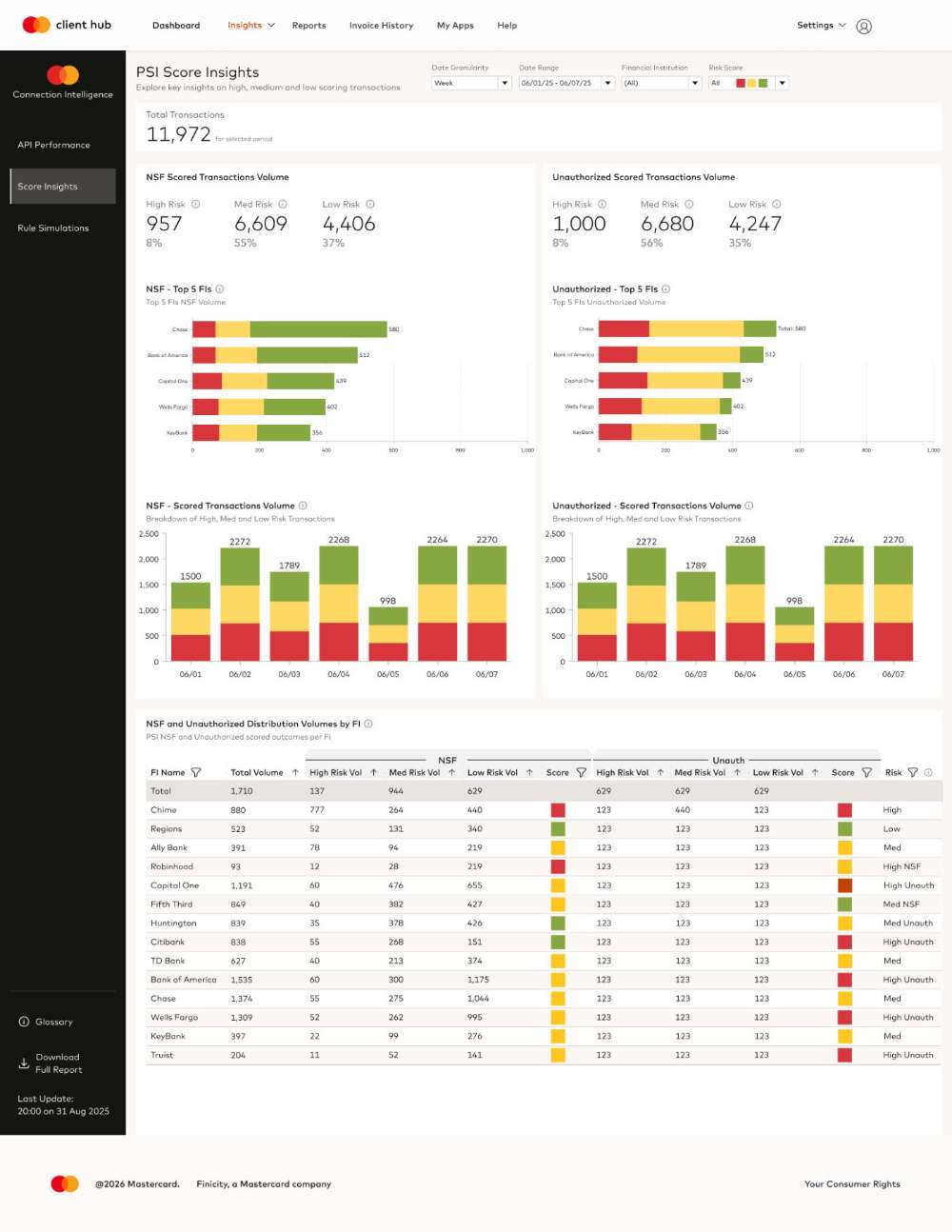
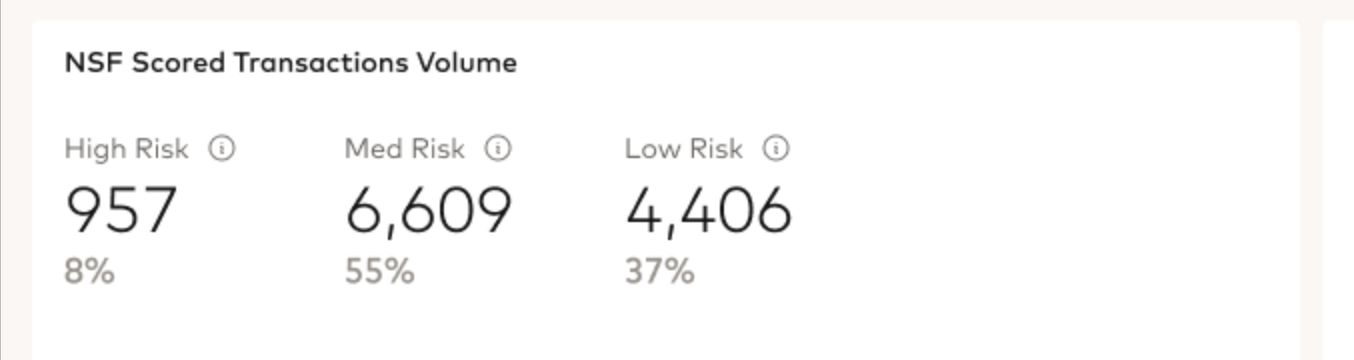
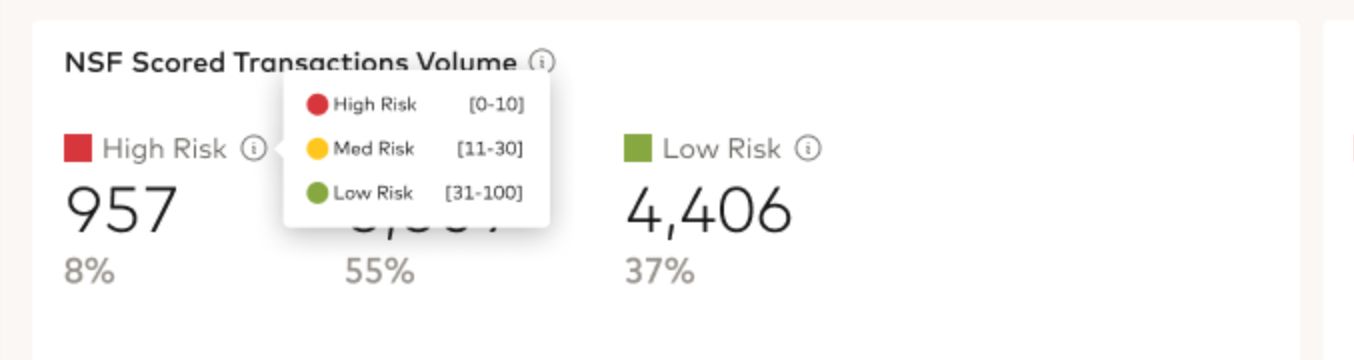
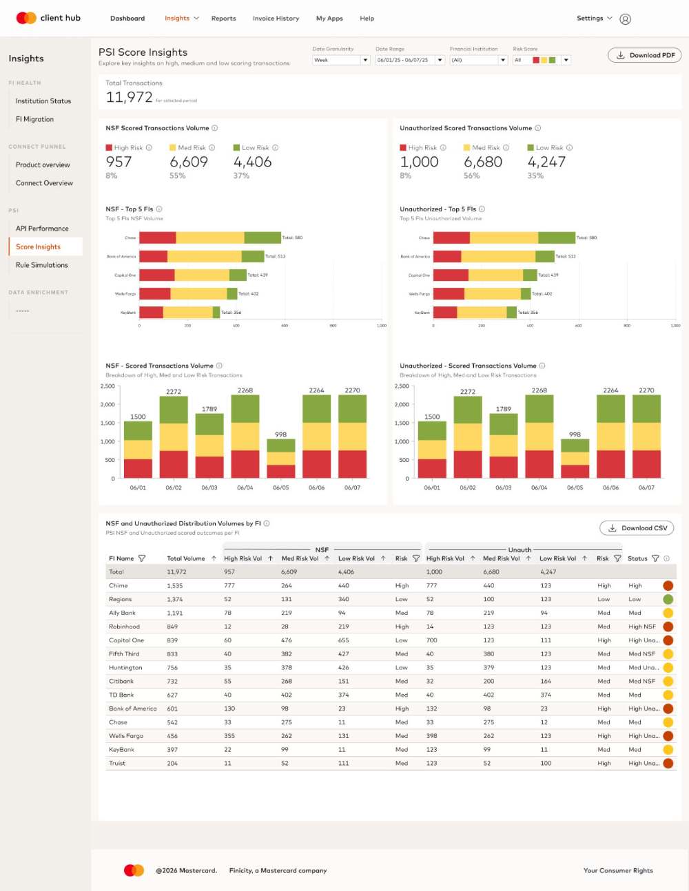
Risk colors that name their own rangeRed, yellow and green carried no scale. Hovering a risk label now reveals the score band behind each color — High 0–10, Med 11–30, Low 31–100 — so the chart can be read without leaving it.
BEFORE · COLOR WITH NO SCALE
AFTER · SCORE BAND ON HOVER
03RULE SIMULATIONS
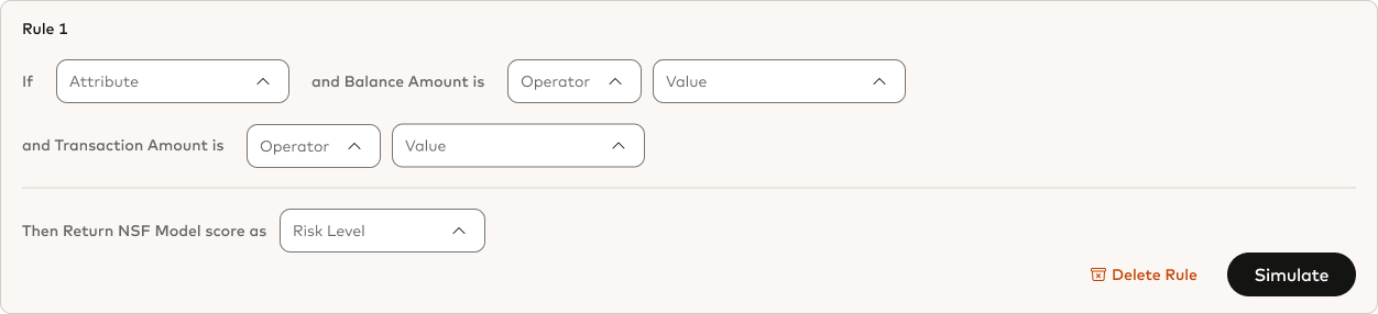
A rule you compose, and a result that comes backThe builder no longer pre-names its own fields. Every condition is picked as attribute, operator and value, so one rule can be written against any attribute instead of the two the form assumed.
BEFORE · FIELDS FIXED BY THE FORM
AFTER · ATTRIBUTE / OPERATOR / VALUE
ALSOA shadow test now returns its result a week later, in the same place the rule was written, so a rule is judged on a week of real traffic before it reaches production.
Final design
SHIPPED · 3 SCREENS
Three screens under one Insights rail, each answering one question and handing the user to the next. Pick a screen, then hover a decision to hold the frame on it.
{{ shipTitle }}{{ shipLede }}
{{ rsWhen }} · {{ rsLabel }}{{ rsBody }}
FINAL · {{ shipLabel }}
{{ rsCta }}
{{ rsCta }}
Top 5 Failed API Reason Code DistributionCount and Percentages of Top 5 Error Code Types
Total Failed API Reason Code DistributionCount and Percentages of Total DS HTTP Status and Error Code Types
The dashboard shipped as the decision layer for PSI, and the behavior it was built to change did change.
REACH
40M→{{ ocUsersBig }}
Open Banking users supported (U.S.)
SATISFACTION
{{ ocScoreBig }}/ 5.0
Clarity and usability, across three test rounds
BEHAVIOR
Reactive→Proactive
From fixing errors to optimizing in a sandbox
OBSERVABILITYIsolated incidents are now distinguishable from systemic API issues at a glance.
INTERPRETABILITYUsers read macro-trends and anomalies instead of isolated data points.
PREDICTABILITYRule changes are validated against historical volume before they touch production.
CASE STUDY / CLIENT SELF-SERVICE
Customize Connect
A self-serve customization tool in Client Hub, so clients can tailor the Open Banking Connect experience themselves — branding, FI search order, and publishing — without engineering support.
PRODUCT DESIGNERLAUNCHED DEC 2023FIGMAWEB
IMPACTShipped to clients
200Unique patterns configured
70%Less reliance on support teams
→ Integration turnaround cut from 2–4 weeks to self-serve
WHAT I DID · JUMP
TEAM
Product DesignerEnd-to-end
Cross-functionalPM · Eng · Client Success
TIMELINE
Research → ShipLaunched Dec 2023
DomainOpen Banking / B2B self-service
What were we trying to solve?
Customization required engineering support, long turnaround times, and back-and-forth with internal teams. Three pressures made that untenable.
ONE BRANDING CHANGE, BEFORE CUSTOMIZE CONNECT2–4 WEEKS END TO END
STEP 1Client requests a change
→
STEP 2Sales engineering picks it up
→
STEP 3Internal build and review
✕NO PREVIEW
First look, already live
DAY 088% OF THE TIME SPENT WAITING ON INTERNAL TEAMSLIVE
FRICTIONNo preview before launch, and no way for a client to iterate or test on their own.
USERSMore control over brandingClients needed the Connect experience to match their own branding and user journey, and could not get there alone.
LOW EFFICIENCIES2–4 week integration delaysEvery change ran through internal teams, driving higher costs and inefficiencies on both sides.
COMPETITIONThird-party alternativesWithout a first-party option, clients turned to external tools to get the control they wanted.
BEFORE — CURATORClients had to contact sales engineering for every change, and could not preview the experience until it went live.
AFTER — CUSTOMIZE CONNECTOne place inside Client Hub to configure, preview, publish, and share the experience.
BEFORE · CURATORAFTER · CUSTOMIZE CONNECT
◀▶
DRAG TO COMPARE
Research & discovery
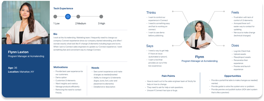
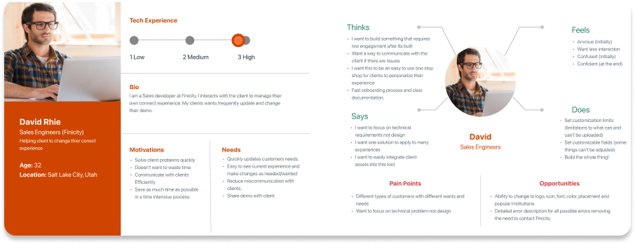
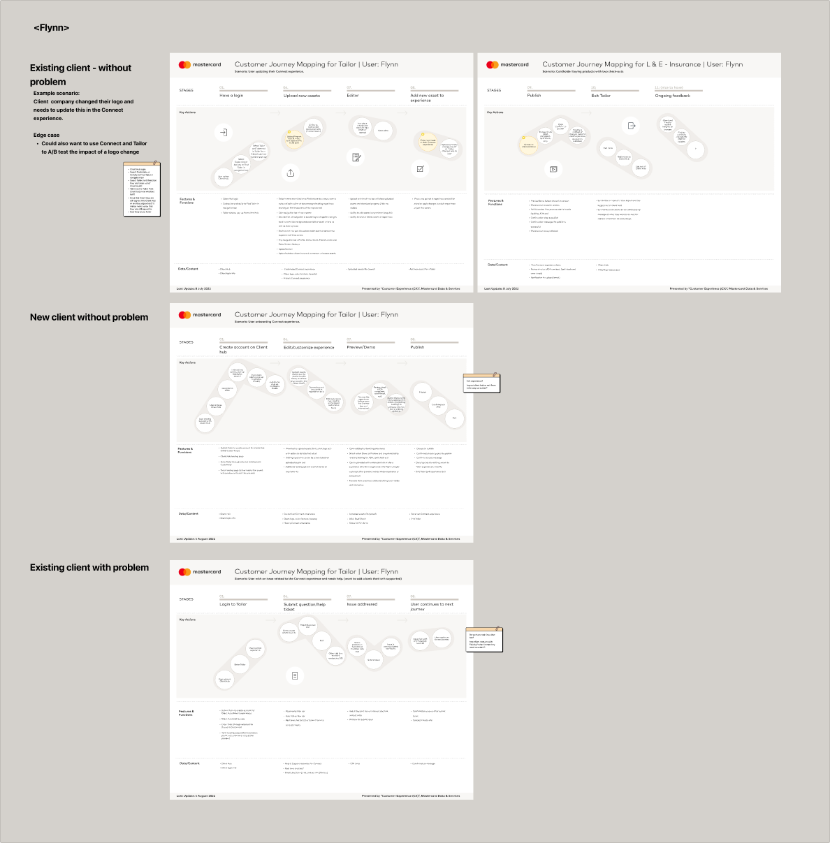
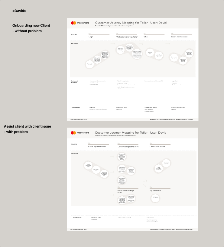
I built a persona and journey map from client conversations, then ran a survey to find where customization actually broke down.
USER PERSONA
{{ jrnLabel }}
{{ jrnPct }}
FINDINGS
ProblemLimited control — aligning Connect with their branding and user journey ran through internal teams. Lack of clarity — with no preview before launch, clients could not tell what was customizable or what a change would look like.
→
What to solvePut branding controls in the client's hands, and make every change visible before it goes live.
Strategy: a self-serve tool, not a service request
Making ‘how might we’ question
“How might we create a self-serve customization tool that reduces reliance on third-party solutions, minimizes internal workload, and remains competitive by offering a customizable and cost-effective experience?”
How self-serve customization matters in business
Customizing without engineering
influences
Letting clients customize themselves means business profits
Lower internal workload & faster onboarding
results in
Retention over third-party tools
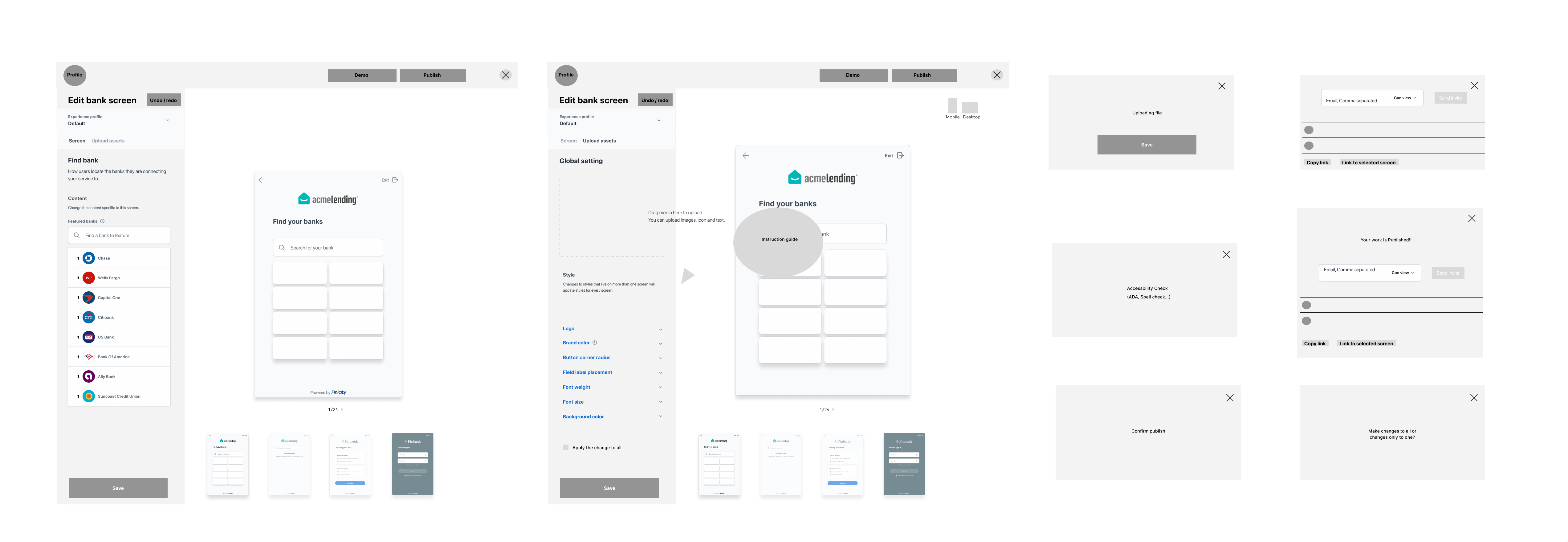
WIREFRAMES — FINDING THE BEST INTERFACE
{{ wfPct }}
WIREFRAMERESOLVED INTERFACE
The wireframes resolved into four decisions that carried into the shipped product.
01Easy customization controlsClients adjust branding elements like logos, colors, and button styles without coding.
02Live previewChanges are instantly reflected, ensuring a smooth and intuitive user experience.
03Guided interactionsTooltips help users navigate the customization process effortlessly.
04Publishing workflowClients can review, test, and publish updates seamlessly.
Testing
PHASE 1Research & discoveryCompetitive review of Curator, Canva and Squarespace to shape the journey.
→
PHASE 2Usability testing12 participants from Client Success and Sales Engineering, observed live.
→
PHASE 3Beta testingWeeks of real use, with weekly check-ins on where testers got stuck.
TESTING DOCUMENTATION
WHAT TESTING CHANGED
FINDING 01Users struggled to find the entry point in Client Hub.Fix · Improved entry point visibility in Client Hub.
FINDING 02Testers wanted one place to change settings all at once.Fix · Added a list view option so settings can be edited together.
FINDING 03Navigation issues — users didn’t realize they needed to scroll.Fix · Highlighted editable screens for easier navigation.
PUBLISH
FINDING 04No publishing flow — users lacked clarity on finalizing changes.Fix · Added guidance pop-ups and a clear publishing flow.
Outcome
Four capabilities shipped in Client Hub, each replacing a request that used to go through engineering.
01Customized FI search
Clients can reorder financial institutions based on their products and preferences. This ensures the most relevant options appear first, streamlining user journeys and improving discoverability.
02Experience settings
By customizing the exit button, uploading logos, and applying brand colors, clients create a consistent branded experience. This reduces friction for end users and strengthens brand trust.
03List view
A centralized list view displays all active configurations, giving clients full visibility and control in one place. This transparency reduces errors and simplifies ongoing management.
04Share experience
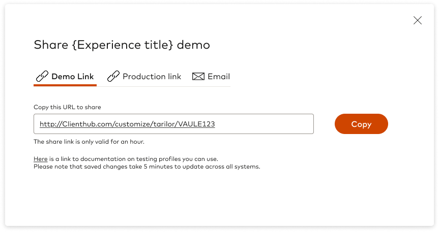
Clients can instantly share demo or presentation links, making it easier to align internal stakeholders and showcase configurations without additional setup.
Impact
Customize Connect shipped in December 2023, and clients started configuring experiences without opening a ticket.
ADOPTION200
Unique patterns configured, showing strong adoption and early traction
SUPPORT LOAD−70%
BEFORE
AFTER
Clients configure and customize independently, reducing reliance on support teams
ENGAGEMENTIncrease
Personalized FI search and branded experience improve relevance, satisfaction, and trust
CASE STUDY / SERVICE CONCEPT
Uber COVID-19 Testing
A COVID-19 drive-thru testing and safety validation feature built upon the Uber app, enhancing user safety for riders and drivers during the pandemic.
PRODUCT DESIGNERAPR — JUN 2021FIGMA, ILLUSTRATOR, MIROMOBILE
IMPACTUsability testing results
+20%User satisfaction scores
+12% / −11%Engagement rate / abandonment rate
→ 50% fewer design inconsistencies across platforms
WHAT I DID · JUMP
TEAM
Product DesignerEnd-to-end
CollaboratorsBen · April · Jacob
TIMELINE
Apr — Jun 202110 weeks, research to prototype
ToolsFigma · Illustrator · Miro
Problem
Riders and drivers carried four concerns into the same ride.
01Safety IssueHIGHEST CONCERN
RIDERWorried about exposing themselves and the driver to the virus.
02Increase in Price
RIDERUber charges by time in the ride, so charges could keep rising during the wait.
DRIVERUnclear what happens to their rates if riders are not charged for that wait.
03Unsure Vehicle Sanitization
RIDERUnsure the other party wears a mask, or that the car is properly sanitized.
DRIVERRising equipment costs, and no guidelines for handling riders’ belongings.
04Unfamiliar Environment
BOTHLong, unfamiliar waits in the Drive-Thru line leave both anxious.
Solution
A Testing service inside the Uber app: one round-trip booking that takes a rider to a drive-thru site and back, with the safety terms stated before the ride is confirmed.
01Testing enters the service menu
Testing sits beside Ride, Food and Vaccine on the home screen, so the flow starts where riders already are instead of on an external booking site.
02The terms come before the booking
The entry screen states what the service is: a round trip to a drive-thru test, added safety measures for both parties, and contact tracing as an option rather than a default.
03Testing sites carry the details that decide the trip
Sites appear on the map with wait time and whether an appointment is required, and the trip is entered as pickup, testing location and drop-off in one form.
04Driver information and anonymous contact tracing
The rider sees who is driving and what the car has in place before the trip, and can opt into anonymous contact tracing so an exposure can reach the other party later.
Outcome
+20%User satisfaction scoresUser research informed product strategy and optimized the experience for complex logistics-based services.
+12%Engagement rateHigh-fidelity prototypes tested for usability raised engagement across the flow.
-11%Abandonment rateThe same testing rounds cut the share of riders who dropped out before booking.
-50%Design inconsistenciesEstablished and maintained UI patterns and contributed to the design system for cross-platform consistency.